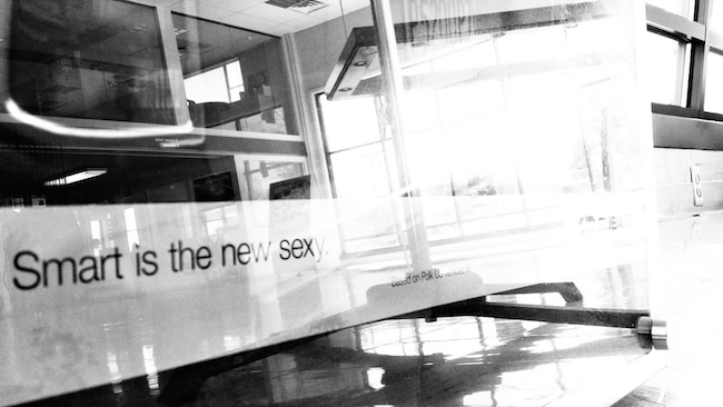
This might surprise you. (It surprised me.)
Since being released in February, Parallax Pro has been the top-selling child theme for Genesis.
No, that’s not what is surprising.
Parallax Pro is a gorgeous theme and the web is smitten with parallax effects. (Plus, the worst fears about parallax are unfounded.) Its enormous sales numbers are expected.
It is sexy — interesting, appealing, exciting. And sexy sells.
Now the surprise.
Would you believe that Executive Pro and Enterprise Pro — two child themes for Genesis that seem to revel in being decidedly unsexy — are also among the best sellers in the StudioPress portfolio?
Believe it.
In fact, Executive Pro is number two on the list, right behind Parallax.
Here’s why …
Sexy sells … but so does smart
Shakira is a sexy woman. (In addition to being a wife, a mother, a humanitarian, and a seemingly pleasant and nice person.) We can all agree on this right?
And she sells. Records, concert venues, merchandise, and now even TV shows.
Shakira’s look, her moves, her voice, her aura — heck, even her name — combine to create a visceral reaction.
And that visceral reaction leads to people taking action.
Emma Stone also makes people take action.
She’s a bona fide A-list actress, she stars in hilarious viral videos, she dates her handsome co-stars.
But you wouldn’t exactly call her sexy. And neither would she, in fact. “I’m not there to be the token sexy girl,” she told People Magazine. “I don’t know that I would ever be able to pull that off.”
- Pretty? Yes.
- Elegant albeit occasionally (and endearingly) goofy? Yes.
- Intelligent, engaging, and articulate? Yes, yes, and yes.
But not necessarily sexy.
Great. So what’s the point? How do Shakira and Emma Stone relate in any way to StudioPress themes?
Because I want you to think of Parallax as Shakira … and Executive and Enterprise as Emma Stone.
But understand that, like these two celebrities (who are both actually smart and sexy in their own ways), these themes are actually far more alike than they are different.
Which one you choose just depends on what you need.
Genesis 2.0 is the real superstar
I mentioned the most striking feature about Parallax Pro above. But that isn’t the most important feature.
If Parallax was not built on HTML5, wasn’t mobile responsive, and didn’t have all of the optimization, security, and support features of Genesis 2.0, it would be an afterthought. Executive Pro and Enterprise Pro also deliver all of these essential features.
The differences in the themes are mostly aesthetic. While Parallax has more striking visual features (like Shakira), Executive and Enterprise have more classic looks (like Emma). This is why the latter two work so well for corporate and business websites.
Themes like Parallax (and Ambiance) push the envelope with their design. They are at the forefront of the latest trends. But what if your audience isn’t? Then you want a more straightforward, more classic design … but classic that is fresh, that maybe even seems strategically restrained.
This is the appeal of Executive and Enterprise.
But don’t just take my word for it …
Look at the demo for Executive Pro. Look at the demo for Enterprise Pro.
These are designs you know, that you’re comfortable with. They’re designs your audience is comfortable with. And they have the latest Genesis 2.0 code serving as their foundation.
For you and your business, what Executive and Enterprise deliver may just be the best of both worlds. The sales numbers sure show that for a large swath of our audience and customer base, this is true. (And what’s more sexy than sales?)
Again, don’t take my word for it. See how real customers with real businesses are succeeding by using Executive and using Enterprise right now.
If you click those links, you’ll find examples of sites that may not quite shake their hips like a Parallax site, but they still catch the eye, hold attention, and provide useful information clearly.
To tell some stories on the web, maybe even yours, that’s all you need.
What do you need?
If it’s a bolder kind of sexy, you know where to go.
But if it’s simple and smart, and you want your sexy subtle and understated, then consider taking Executive Pro or Enterprise Pro for a test drive.
One of them may well represent the intersection between what your brand represents and what your audience expects — that sweet spot where conversations flow and conversions become common.
Right Emma?

Flickr Creative Commons Image via Nomadic Lass.
Emma Stone GIF via ReplyGIF.net.
Jerod Morris
Jerod Morris is the Director of Content for Copyblogger Media. Get more from him on Twitter, Google+, or at JerodMorris.com.
The post Should Your Site’s Design Be Sexy or Smart? appeared first on Copyblogger.
Related Stories
- Easy Design Tricks That Will Lift Your Web Sales
- The 2 Reasons People Don’t Click on Your Buttons … And How to Overcome Them
- The 2 Reasons People Don’t Click on Your Buttons … And How to Overcome Them – Enclosure
Source: Copyblogger
Should Your Site’s Design Be Sexy or Smart?

No comments:
Post a Comment