You have 0.05 seconds to make a good first impression online.
That’s only 50 milliseconds to hook someone — according to researchers at Carleton University.
Most important, this happens before a user reads any of your content. So, you have to capture their attention with your website’s nonverbal cues.
Do you have any of the following?
- Low conversions
- High bounce rate
- Short average visit duration
- Low sales
- Slow traffic
Then you need to optimize your website’s nonverbal first impression.
I’m a human behavior hacker, and I’m going to show you how to use science to optimize your website.
Why human behavior science?
Let me be blunt:
If you don’t understand online human behavior your website will fail.
Sure, you can produce killer content — and that’s a great start. But even if your blog unveils the meaning of life while saving baby pandas from grumpy cats, it’s not enough.
You have to understand your reader’s behavior to get them to convert. This is all about making sure your website produces a killer nonverbal first impression.
Below I have laid out six scientifically proven hacks to improve your website’s visual cues.
Hack #1: Understanding eye patterns
Do you know how your readers see your website?
The Poynter Institute tracked eye behavior as users read various web pages. They found that reader’s eyes follow an F-Shaped pattern on a website. Typically they start in the upper left hand side of a web page and move across and then down, across and then down.
See how we have added headings and buttons in the F pattern on our website:
Why this matters: If you know where people’s eyes naturally flow, you can place your content, headlines, and buttons within the eye map.
Hack #2: Use nonverbal trust indicators
Trust is a huge part of an online first impression. But you can’t just say you’re trustworthy … you have to show it.
It’s actually fairly easy to demonstrate trust nonverbally. Here’s how:
- Show your hands. Body language research has shown that our hands are our best trust indicators. Meaning that when people can see our hands, they feel they can trust us. When choosing photos or filming videos for your website try to show your hands as much as possible.
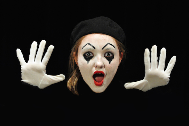
- Understand facial expressions. There are seven universal facial expressions. You want to make sure that the photos and videos on your website are conveying the right message. The biggest mistake I see is when people use photos of themselves smirking — this is the universal expression for hatred or contempt, not happiness (as many people believe).
We relaunched our website to include a header image showing my hands and photos that only showed positive facial expressions. Check out the difference in the number of visits after the relaunch (The spike is the day we announced the relaunch to our users):

Why this matters: Picking the right photos for your website can be incredibly stressful—but they matter! Follow the rule of hands and facial expressions to guide you.
Hack #3: Initiate action nonverbally
When a user comes to your website you want to give a positive first impression and then have them take action. How can you do this nonverbally?
One way is to use hand gestures. You can use your hands to gesture where you want people to look at or what you want them to do.
For example, this is the confirmation page people get when they sign up to our Monthly Insights.

As you can see, I ask them to follow me on Twitter. The previous page had only text and converted people to Twitter about 0.6 percent if the time. When we added the image it increased to 5.4 percent.
You can also use eye gestures. You do this by using images in which the person is looking toward the action item.
For example, if I want people to keep scrolling, I put in this image — nonverbally telling them to look down.

You can also do this to get people to watch videos or click on buttons.
Why this matters: You want people to take action on your website. You can do this by guiding people nonverbally.
Hack #4: Focus where your visitors focus
Dr. Hong Sheng at Missouri University of Science used an eye-tracking software with an infrared camera to monitor eye movements of students as they scanned certain websites. She found that there were certain features on a website that drew the most attention:
- Logo
- Main navigation menu
- Search box
- Social networking links
- Primary image (whatever image was at the top of the repeating header or page)
- Written content
- Website footer
Why this matters: Trying to decide where to focus your efforts? These are the areas that most help your readers decide what they think of your website.
Hack #5: Website color psychology
In another Missouri University study, students indicated that color had a large effect on how much they liked or trusted a website.
Leo Wildrich at the Buffer Blog has an amazing post on the science of color and what each color represents for branding. Here are some top colors and what subconscious messages they send to users:
- Blue: loyalty, stability, tranquility
- Yellow: happiness, optimism, youth
- Green: healing, success, hope
- Black: power, mystery, professionalism
- White: purity, cleanliness, innocence
- Red: passion, sexuality, intensity
- Purple: royalty, spirituality, luxury
- Orange: energy, fun, warmth
Why this matters: Your nonverbal brand needs to match your mission. Using colors is an easy way to showcase what you are all about.
Hack #6: K.I.S.S. (Keep It Simple Stupid)
Embrace white space.
Stick to the basics.
Keep it simple.
A Harvard study found that the more complex a website, the less appealing the website is to visitors.
Here is an example of a website with high complexity (and therefore is not very appealing):

This is the aptly named World’s Worst Website.
And here is a website with a low complexity score (so it is therefore highly appealing), the also-aptly named Simple.

Google Research also found that users like “prototypical websites,” or websites that fit into a user’s expectations of the category. For example, ecommerce websites shouldn’t look too different from other ecommerce websites, blogs shouldn’t be organized too different from other blogs, et cetera.
Why this matters: Less is more.
Content isn’t everything
If you don’t make a good first impression, people are less likely to read your content.
Remember, your written content actually has very little to do with your first impression. Nonverbal cues are far more important than your words during those 0.05 seconds when visitors are developing their initial feeling about your site.
And if you don’t build trust and make it intuitive for visitors to navigate your site, they most likely will not sign up, purchase, or come back. Because nonverbal cues are critical to the success of your calls to action.
So keep on creating useful content, but don’t forget to pay attention to (and optimize) the nonverbal signals your website is quietly communicating … because your visitors hear them loud and clear.
Which of these six hacks are you most excited to implement right away?
Are there others you’ve used to achieve better nonverbal communication on your site?
Tweet me or join the discussion on Google-Plus.
Flickr Creative Commons image via Len Radin
About the Author: Vanessa Van Edwards is an author and behavioral investigator. She runs ScienceofPeople.com, a human behavior research lab. Get more from Vanessa on Twitter.
The post 6 Nonverbal Hacks for Your Website So it Captures Attention and Converts appeared first on Copyblogger.
Related Stories
- 5 Reliable Ways to Use Content as a Referral Tool
- 5 Tips for Turning Drab Information Into a Tantalizing Tutorial
- Here’s How Bestselling Author CJ Lyons Writes
Source: Copyblogger
6 Nonverbal Hacks for Your Website So it Captures Attention and Converts
No comments:
Post a Comment